Blind Pig - Fall Semester, 2010
Fall semester I had the opportunity to get in on a very unique studio. This was a combined graphic design/industrial design interdisciplinary studio lead by our respective professors with support and direction from the fantastic Sky Design of Atlanta, GA.
In this studio we got real world experience on what a typical branding project might entail. We were placed into small groups consisting of one or two graphic and one or two industrial design students. Different groups had different entities to brand. Options included a bank, a baseball stadium/team, a city, and a restaurant.
Once we were placed in our group and given our entity to brand, we began by researching restaurants and possible themes. We were largely given free range to pick what we wanted to work on as a group, though we were given an extensive list of final deliverables and strongly encouraged to flesh out our project with additional touches, all the while keeping a realistic and coherent brand identity.
Our group decided on a Speakeasy theme, so we then began researching speakeasies, the 1920s, and prohibition, among other things. While researching, we came up with a number of possible names but gravitated towards Blind Pig, as it had the fun, relevant feel we were looking for.
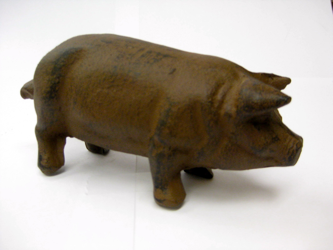
So, essentially a Blind Pig was a speakeasy. You paid to see an animal, or some attraction, and were given a free drink with your admission. Frequently that
"attraction" might even be a small figurine or statuette of a pig or other animal. Hence the term "Blind Pig." You'll never know quite how hard it is to find a reasonably priced metal pig until you need one...
"attraction" might even be a small figurine or statuette of a pig or other animal. Hence the term "Blind Pig." You'll never know quite how hard it is to find a reasonably priced metal pig until you need one...
We utilized muted colors, wood, and in many of our designs copper, to suggest the time period and feel that we wished to convey. Credit for the stellar graphic design work goes to Kristen West. She was the graphic design lead in our group and did an excellent job on both the designs and managing such a work load with the time given.
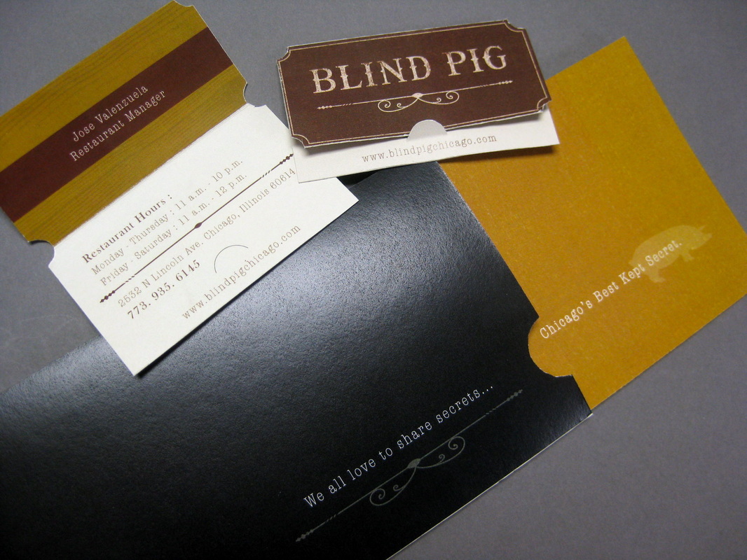
Business card and gift certificate holder. This was one of the ways we were able to incorporate a fun, "secretive" element in line with our speakeasy theme.
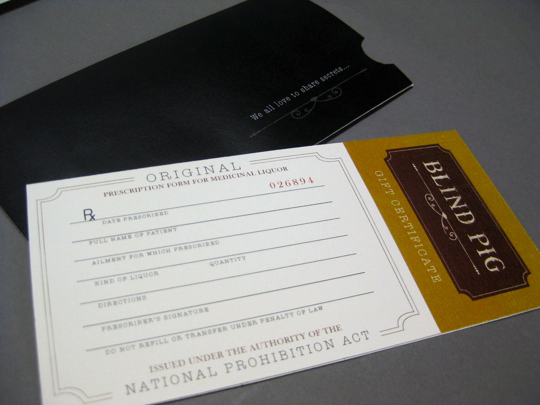
This gift certificate is one of the elements I'm particularly pleased with. While watching a History Channel program on Prohibition some ages back, I learned that there was in fact legal alcohol available then, you just had to get a doctor's prescription. I thought it would be fun to have a gift certificate reminiscent of the alcohol prescription pads, and people would get a kick out of historical similarities and recurrences.
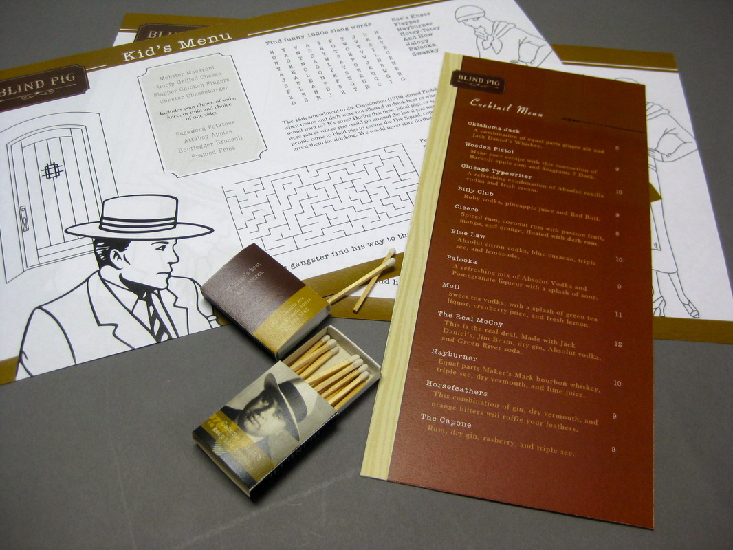
Since we were designing a family-friendly restaurant, we thought it would be fun and appropriate to make a kid's menu/placemat. Taking cues from images found during our research, I made elements for the menu using Adobe Illustrator.
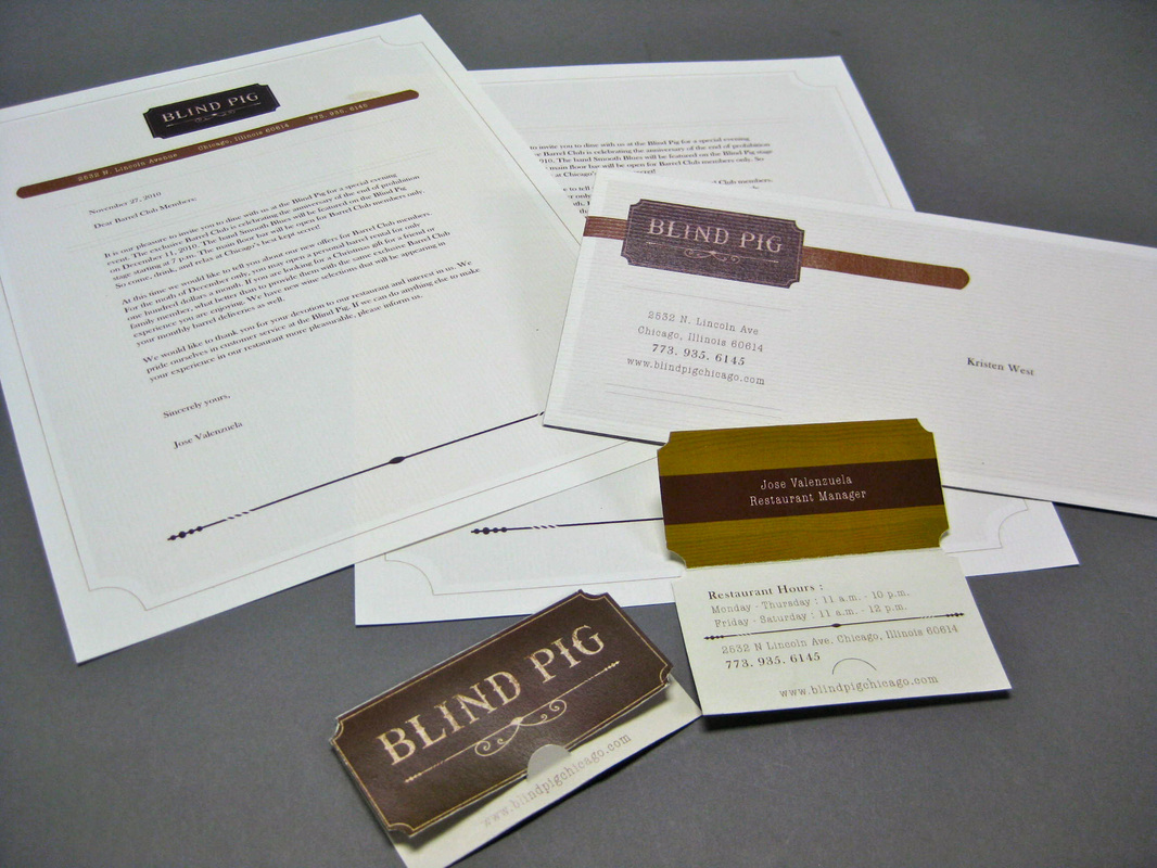
Letterhead and stationery suite.
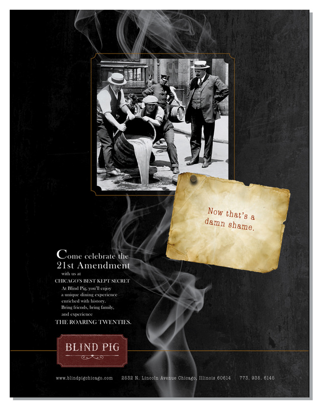
Along with research and resource gathering, the ID crew were able to contribute to a number of elements, including the content of the advertisements, among other things. I particularly enjoy working on advertisements and had a lot of fun working on the ad content for our project. Though I'm a bit partial to this one, I made certain to put out a number of other ideas, and we were careful to have a couple of ad options that could go in magazines aimed at a variety of audiences.
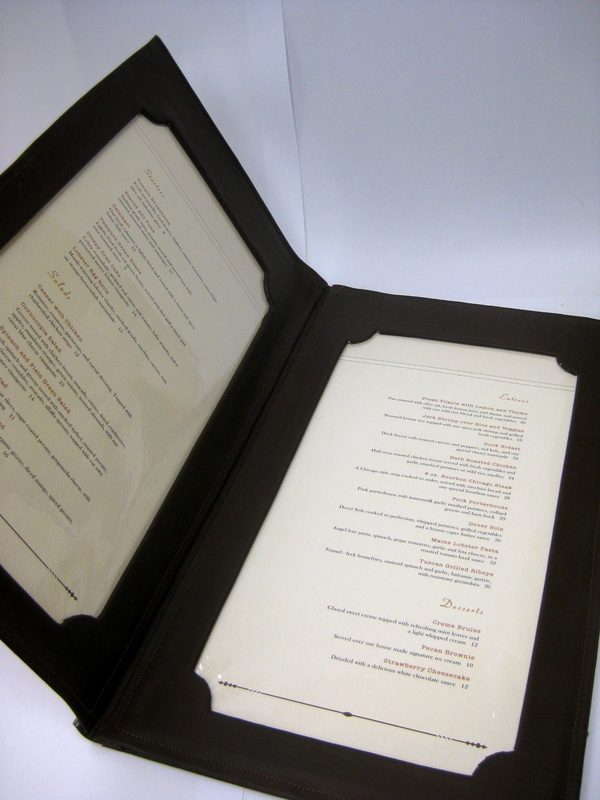
Unable to find a fancy menu cover that had all the elements we required, our third group member, Jose Valenzuela, picked up some imitation leather, broke out the sewing machine, and cranked out this custom menu holder.
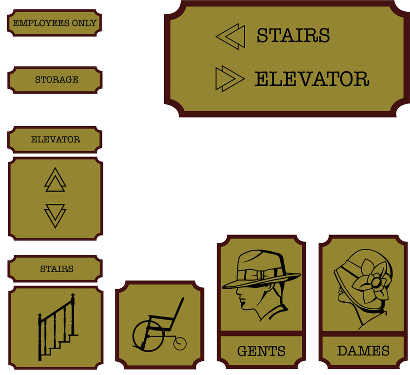
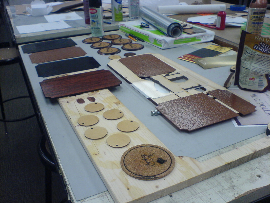
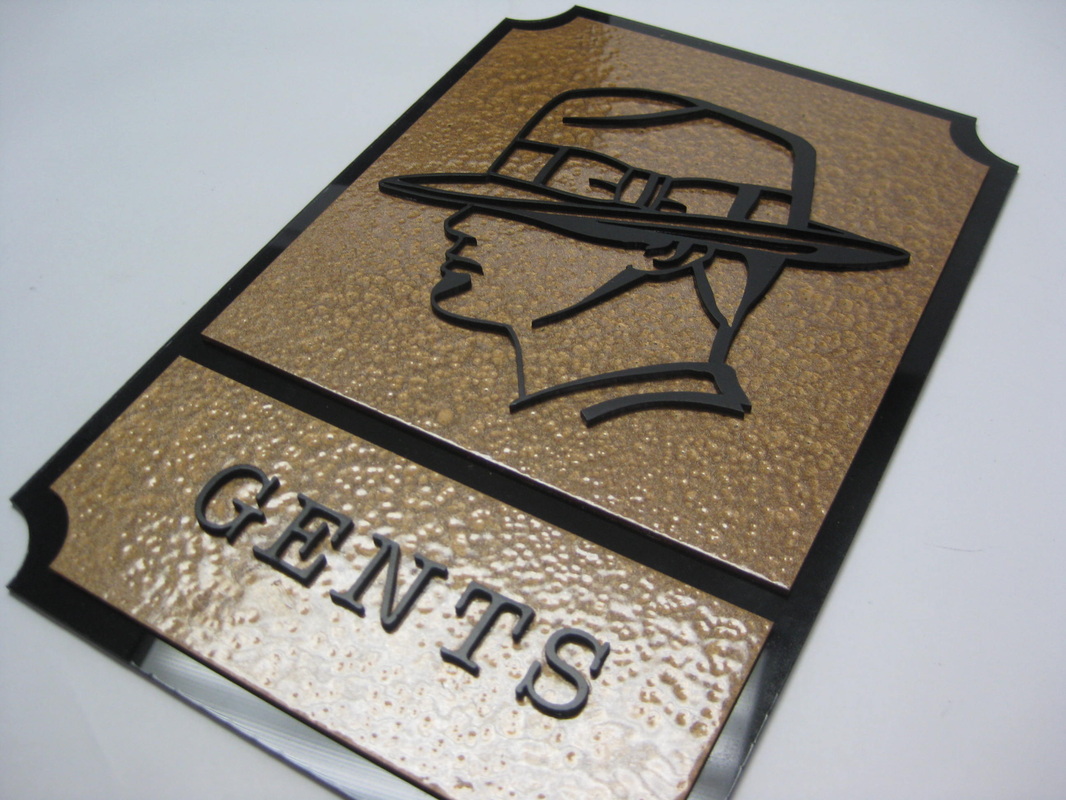
A view of all the signs and their relative sizes. I particularly had fun working on these. They were to consist of a stained and lacquered wooden base-plate with a copper mid-plate, and painted acrylic icons, epoxied into place.
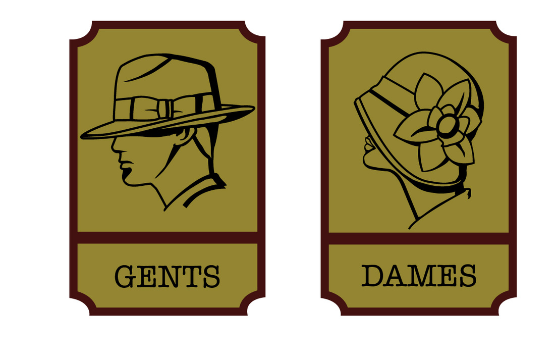
Men's and women's restroom signs.
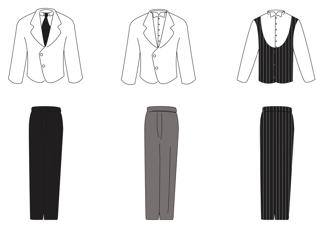
Host,bartender, and waiter uniforms. I loved this project. We got to work on such a varied assortment of elements. For the uniforms, I researched period dress and uniform. The rather low cut of the vest is in keeping with the uniform vests of the time, even though current restaurant vests have crept upwards over the years. This was one of a number of simple and inexpensive ways to customize our product to produce just the look and feel we were going for.
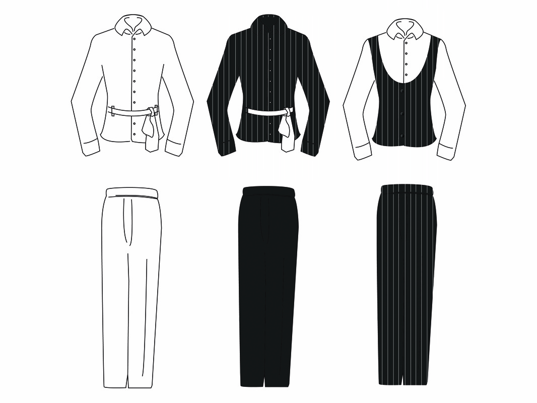
Women's uniforms. We wanted to provide elements reminiscent of the time period while still providing comfortable and practical restaurant staff uniforms. (I can personally attest to this being very important.)
It's dangerous to have a clean desk top in studio! If you haven't dirtied your own desk, it's only a matter of time before random classroom supplies start migrating your way. Even this was apparently too clean to resist the gradual creep of snacks and classroom paper...
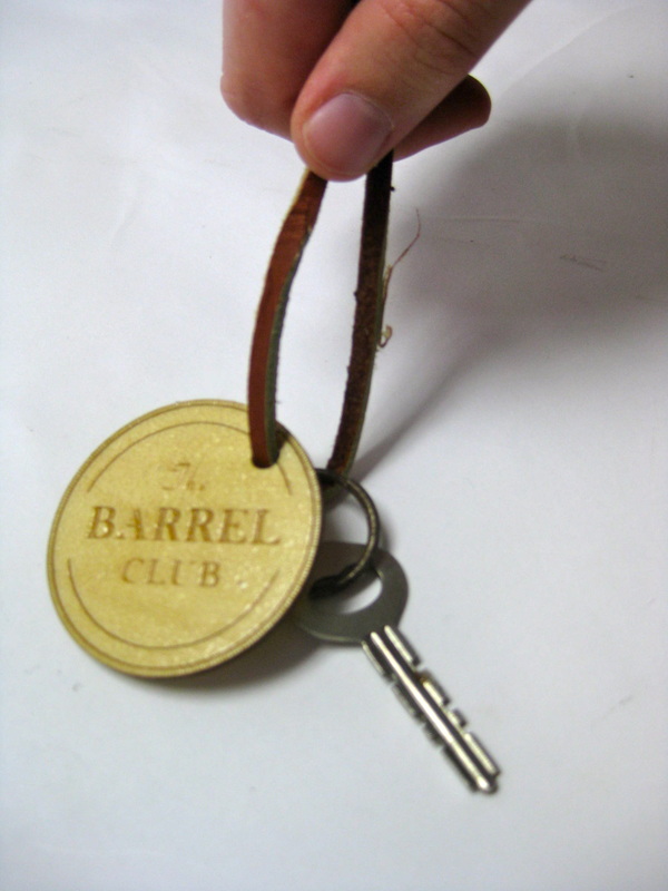
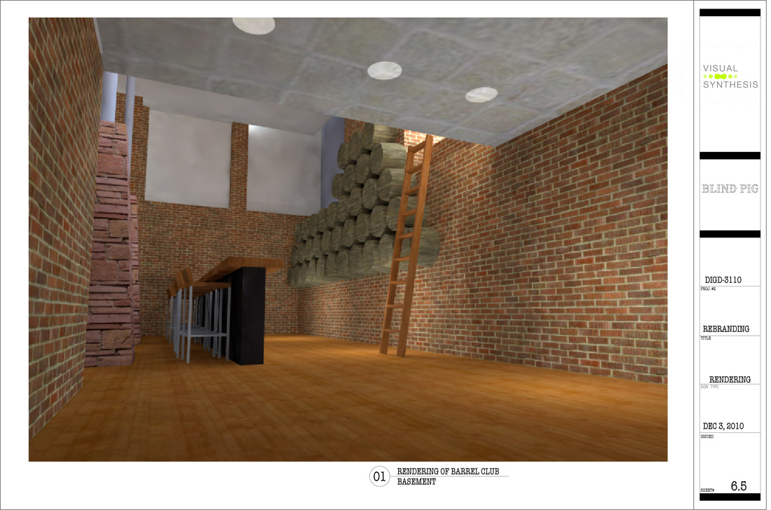
Though we were designing a family-friendly restaurant, we still wanted to utilize the downstairs area for a special members-only club, hidden away & with its own identity while still keeping with the overall brand identity. One location the logo for that club is visible is on the members' key & chain.
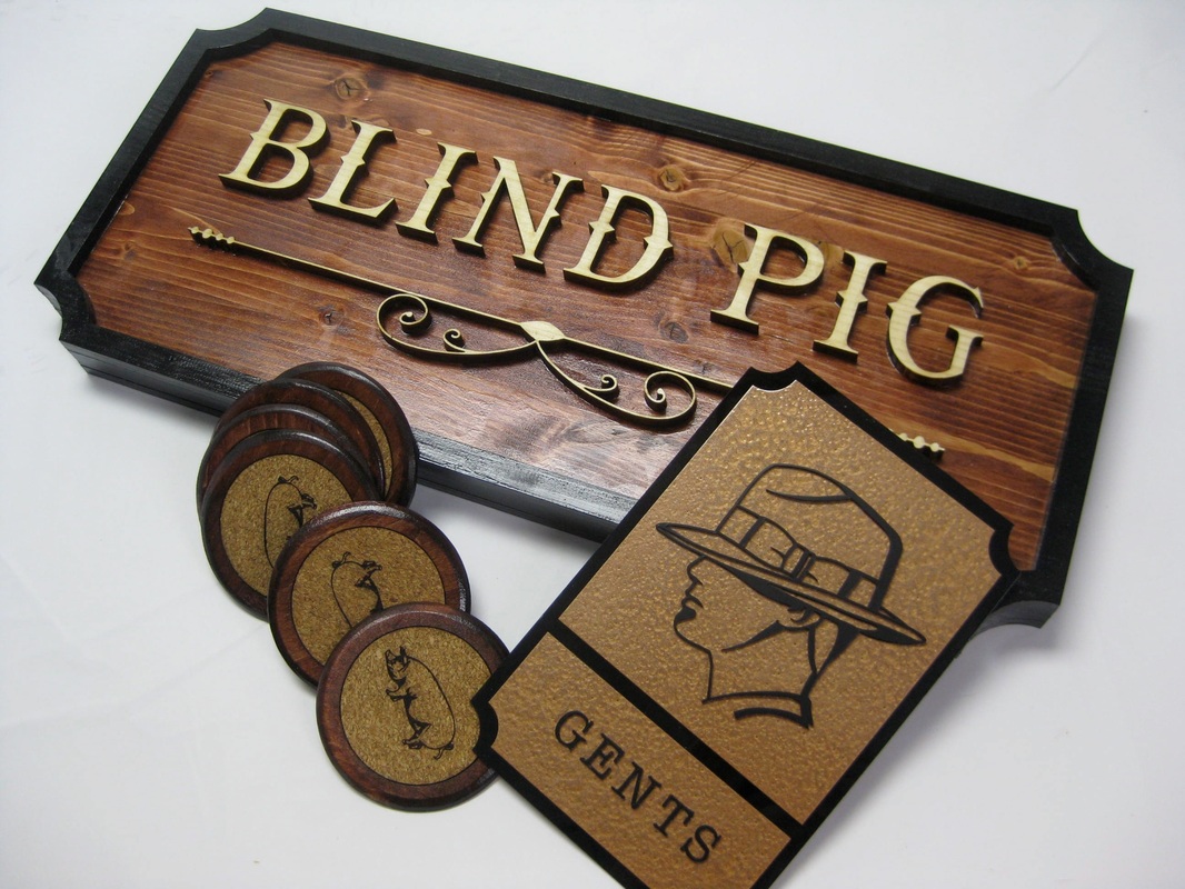
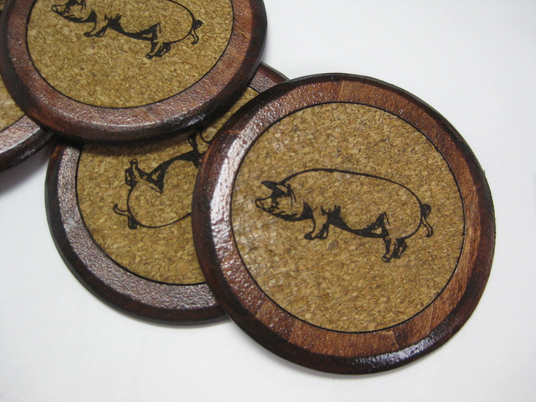
Our finished coasters, bathroom sign, and miniature building sign.
Coasters. Laser-etched pre-cut cork rounds, sanded laser-cut balsa wood, red mahogany stain, lacquer, epoxy.
Men's restroom sign. Laser-cut acrylic, "hammered copper" spray paint, black spray paint, and epoxy.
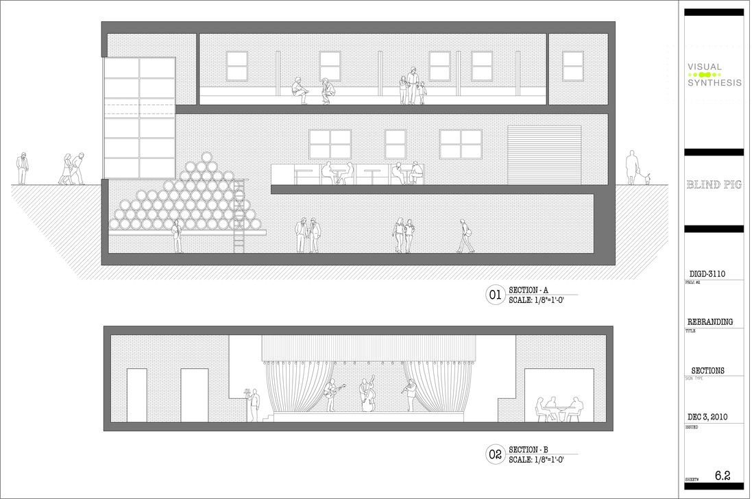
While we all had input into the final design of the space, the
task of bringing it to life went to Jose. Recently graduated with a degree in architecture and working on a second Bachelor's, he was well versed in architectural 3D and blueprinting programs.
One of Jose's renderings, a view from the Barrel Club level.
