Non-Screen User Experiences
This was one of my favorite classes in my Master's Degree program. It combined mobile/digital with tangible objects to cover a wide range of user experience issues and concerns. With a background in ID, this was particularly fun to get to work across a wider range of interactions methods than "simply" digital.
This was also one of the earlier classes where we got to take a project from start to finish. While we'd covered many of these elements separately and more in-depth in other classes, this is where we really got to start putting it all together. We were able to choose a particular item or service as our starting point, and I chose the Awair air monitoring units.
The premise of the project was: “Awair, the air quality and testing IoT device maker, wants to create a next generation of app and product that is easier to set up and use than their current generation products, and would like to discover any additional pain points or areas for improvement that their users might have that could be addressed during this iteration.”
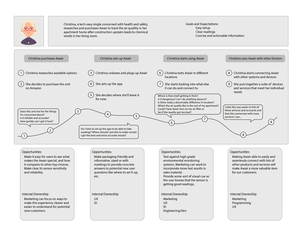
Most of this class was a pretty typical, straightforward exercise: we created and ran surveys, interviewed users, crafted personas and journey maps, performed field research, etc. But every project develops in its own way, and it was fun to see how this lined up with and deviated from other similar projects I'd worked on.
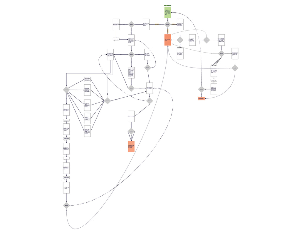
We also spent some time during this class to work on voice interfaces. Some projects leaned more heavily into it than others, but we all worked through some exercises planning and utilizing VUI. The following is an example of one of the conversation trees I developed during this class.
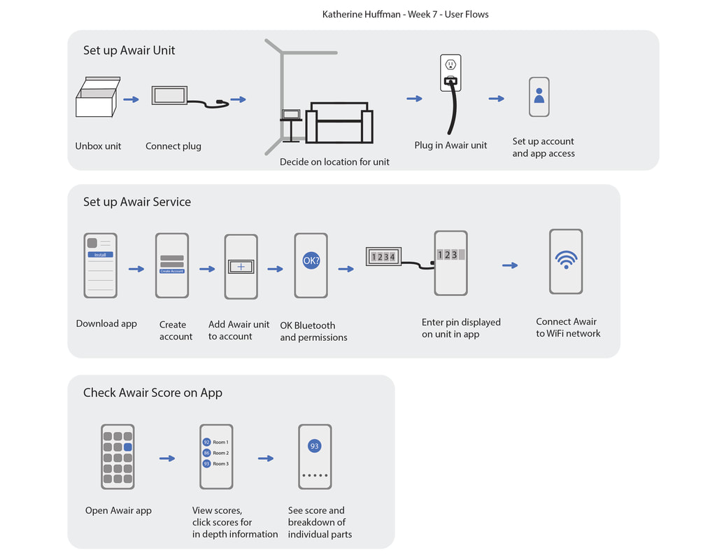
An integral part of this project was researching how individuals and households would use the Awair unit and set it up. The biggest areas for improvement discovered during this unit were that users wanted to be able to put the Awair device wherever, as opposed to being limited by the power cord, and that they wanted additional display options that would let them immediately see what readouts and data they were looking at, rather than having to try to remember what set of points meant what.
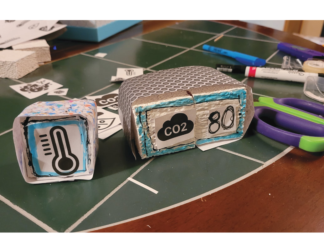
This was a particularly fun one for me. While my background’s industrial design, I haven’t actually ever run into a case where I’ve gotten to put together one of these “rough prototype kits” even though I’ve seen them in a lot of articles and case studies before, and many of our designers at work have a modified equivalent of this where we make and paint production grade parts that can be swapped out to test various color or detail combinations. If I were doing this “for real,” I would definitely have spent more time planning out and standardizing the kit. I’d have probably still begun construction of the kit much the way I did here, with quick, hand-cut scrap-foam blocks, print outs, etc., but would have moved from the ultra-rough-prototype kit that I had here to a more “manufactured” kit for “official” studies: foam blocks would have been made of higher density foam or wood, cut out on quality shop machinery, or even 3d printed. Outer housing materials would have been pre-applied to their respective “lego” pieces, and would have varied in color only within their respective categories: i.e., if the point was to test what sort of material folks found most pleasing, outer housing pieces would have come in white wood/white metal/white fabric/white plastic, while if the point was to test what visual look folks liked most, there might have been either an abundance of different options, or, after choosing, say “fabric,” within that kit there would be many different color and exterior radius options. “Tape and toothpicks” would instead be magnets already installed in each piece (polarity checked, of course!) and there would be nothing to cut out, as even “Draw your own” options could utilize an option like pre-cut white or clear vinyl squares of the same size as the blocks.
While none of the test users had too terribly difficult a time connecting the unit to their account and app, all of the users had insights regarding display of information, both in the app and displayed on the unit.
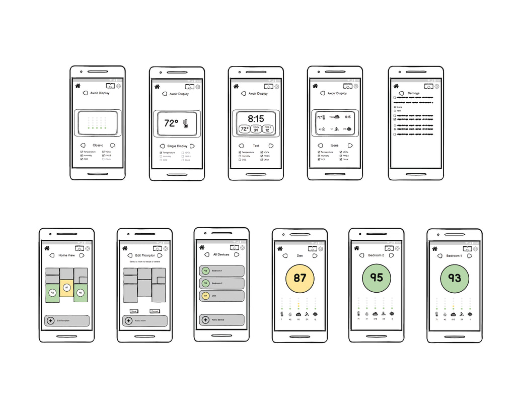
For this version of the Awair app, I kept most of the individual unit display screen the same except gave the option in settings to swap between icons and text. I also added the ability to scroll through rooms and displays without having to return to the “all devices” screen every time, though also kept the ability to return to that screen at any time without having to tab through the rest of the options.
Another new feature added is a “Home View,” a floorplan style view so that the user can see room by room laid out together, and more easily track trends in air quality. This provides a more visual and impactful view, helping the user to feel more confident in their understanding of household air quality, and allowing them to track and potentially pinpoint any issues that might be present in their residence. Settings for adjusting the unit display were a few layers down in the regular settings menu, so I moved the display settings to its own menu to make it easier to get to and added options for customizing the display based on the upcoming generation of Awair unit.
There’s a lot of room for this project to grow. I’d love to get to carry on with a combination of ID and UX to develop a full prototype next-gen Awair unit utilizing a lot of the insights gleaned from this research and study.
While I had some familiarity with many items and methods, I really enjoyed getting to branch out, testing new methods and firming up ones where I had less experience. I’ve mentioned it a couple of times now, but I had particular fun with the co-design part of the project. There were so many little bits and pieces I took away from this unit, and, while I can’t speak to Awair’s business plans, it just feels like there’s a lot of really valid insights there and opportunities for improved versions of their devices. All in all, a really interesting project that spanned across multiple screens/displays and disciplines.
While I had some familiarity with many items and methods, I really enjoyed getting to branch out, testing new methods and firming up ones where I had less experience. I’ve mentioned it a couple of times now, but I had particular fun with the co-design part of the project. There were so many little bits and pieces I took away from this unit, and, while I can’t speak to Awair’s business plans, it just feels like there’s a lot of really valid insights there and opportunities for improved versions of their devices. All in all, a really interesting project that spanned across multiple screens/displays and disciplines.
